David Chenery of Object Space Place, delves into the deeper principles in Japanese interior design and how this thinking can translate into design for hospitality.
I’ve always been struck by the depth of thinking in Japanese design, with many intangible concepts rooted in their cultural heritage and understanding. To me, there is much to learn from both the rigour and holistic quality of these principles. I appreciate much of the aesthetic that this creates too, particularly the more minimal end of the spectrum, where materials are used sparingly to create quite subtle, quiet spaces of very high craftsmanship and symbolism. Naturally, the noisy extreme exists too, (I think of the cultural language of J Pop and Manga) but that is not what I am discussing here.
Below are 4 key ideas based on a number of specific Japanese principles, and how I see them applying to the design of spaces. I think these qualities in many ways transcend what we might call eastern and western design approaches, at the risk of sounding grandly philosophical, they shine a light on human nature and how we experience our everyday reality.
Subtlety and restraint
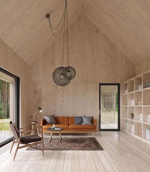
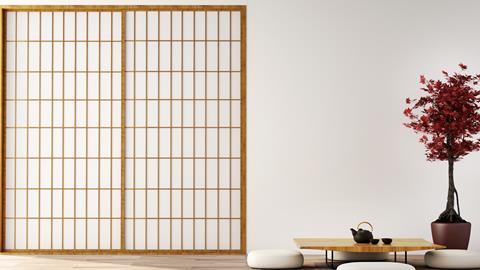
One of the most visible aspects of Japanese interior design is the quality of minimalism, sometimes taken to almost a monastic austerity, which contrasts against the mass consumerism and throw-away culture of modern society. A large driver for this aesthetic is the concept of Zen, more particularly the principle of Kanso which pertains to a sense of simplicity. By paring back the space to only what is essential, everything that is left is elevated in importance. When there is less visual ‘noise’, you can more easily make out the quietest ‘whisper’ – how the light changes throughout the day, how your chair really feels to sit on, how cold the stone countertop is. The principles bring about an environment that quiets the mind and brings focus. Everything in the space is an end in itself to be savoured rather than simply used in an unthinking way as a means to an end. Deliberateness is the goal.
In the context of restaurant design, the idea of restraint and subtlety will not suit all hospitality concepts. For some, a highly layered, almost chaotic atmosphere is needed to create a high-energy customer experience. You need to work out where you sit on this energy scale. How do you want your customers to feel when they leave, are they here to savour the food and conversation with their friends? Or are they here to be entertained?
Whatever the desired result though, the idea you should take from this principle is that every aspect of the environment must have a reason for being there. Everything should be considered for how it creates your customer experience. Everything must perform its function. Not just in the sense of physical performance, but also in what story it tells and how it makes people feel. This important quality of deliberateness, of being in control, is likely to make you question whether everything you have or do is necessary. It will also encourage you to take time over relatively small details like where the high chairs will be stored and where fire alarm panels will be visible.
Key question – is everything in your design enhancing the customer experience?
Awareness of our place in time
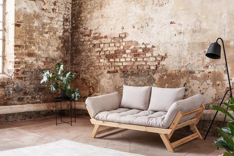
‘Mono no aware’ is a principle that encourages an awareness of impermanence. It acknowledges the reality of time’s effect on everything and everyone and then seeks to celebrate that rather than disguise it. When you reflect on this, it seems blindingly obvious that everything ages and decays, it is the inevitable cycle of life and yet we often choose to ignore it, certainly in design.
Design is often focused on creating a finished product on day one. Conversations about how the design will age positively or where space will be left for nature to take its course are rare. Discussions about time tend to be focused on the maintenance required to ensure something looks the same on day 500 as it did on opening day. Instead of fighting with time (a battle we cannot win as there are no materials that can offer you true permanence), we might design a scheme with high-quality materials that will gain richness with age. For example, bronze that gains a patina, exposed brickwork that will weather, timber that will turn silver grey in the sun.
The strange thing is that we are intuitively drawn to the positives of these qualities (the trend for distressed and reclaimed materials has never been stronger) and yet so often the point is missed. We want the look of something aged without the hassle of actually waiting for it. We want it now so we can just move on to the next thing.
Another challenge with this is that quality materials that age well are more expensive than cheaper ones that will need to be replaced sooner. A restaurant owner may simply be trying to get their business off the ground and the short term pressures and risks are so high, that a long term view can be a luxury. Combined with this, most restaurants are refitted every 5-7 years so many are not trying to create a long term institution. But if we want something deeper, a space with more soul, we must work with this process of aging.
Key question – how will your restaurant age well?
The space in between
One of the most beautiful concepts in Japanese interior design is Ma. It is concerned with the negative space around something, although should not be misunderstood as an empty void. It is a pause, an interval, that brings more meaning to the thing it surrounds. It creates natural flow and harmony in a space and allows clear focus. The Japanese flag is a perfect example. The white background brings focus and attention to the central red icon, it frames it for our contemplation.
Often a design project has commercial pressures to squeeze in as much as possible and leaves little space for the generous pause. But just as there is a perfect pace to the way you serve a table (you don’t give customers a menu and immediately ask them for their order), there should be a natural rhythm to your space that ties into the DNA of your restaurant. The more fine dining you are, the more important these pauses are (the space between tables, the entrance lobby, the toilets) as you are creating a special experience which is driven by generosity.
Key question – how are you creating pauses that choreograph the customer experience?
The beauty of imperfection
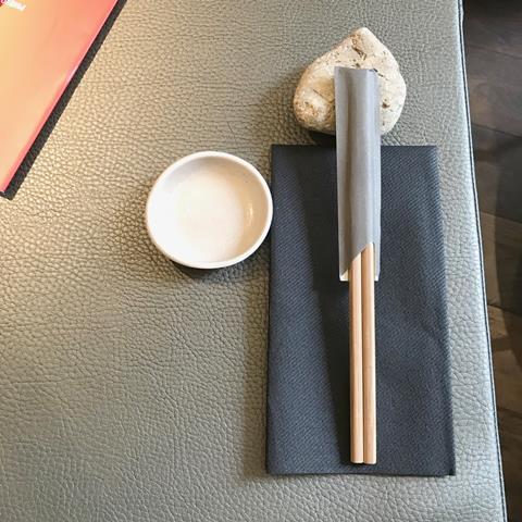
Wabi-Sabi is the combination of two separate principles which have become commonly intertwined. Essentially, the idea focuses on flawed beauty and the beauty of nature and aging. Perfection is a rational idea that cannot be born out in reality, certainly not when you add the dimension of time. The natural imperfection visible in handmade pots.
Another great example is using small irregular rocks as chopstick rests. Importantly, when thinking about this principle in terms of man-made things, the imperfection being celebrated is not the result of bad workmanship but is born of an acknowledgment that human beings leave a mark on things they come in to contact with. The process of making should be visible in the end result. Similarly, when thinking about natural elements, we should not seek to rob them of their past by knocking off the rough edges and making them uniform.
Restaurant designs can fall into the trap of creating an unenjoyable experience when they feel too synthetic and controlled, when the positive side of imperfection is not allowed to occur and all the ‘soul’ is taken out. As human beings, we intuitively respond well to the beauty of imperfection. Hospitality is a people business at the end of the day and it benefits from celebrating the involvement of the human beings that have crafted both the environment you are sitting in and the food you are eating.
Key question – how does your design bear the marks of being positively imperfect?
- A version of this piece was originally published here.
Precis


